Best Practices of
Jira Dashboard Reporting
A guide to creating simple, impressive and easy to understand Jira dashboard reports
Trundl & Morgan Folsom
February 10, 2022
Agenda
- Good vs bad dashboard reporting
- Basics of good Jira dashboard reporting
- Stepwise guide to creating simple and easy to understand Jira dashboard reports with Custom Charts
- Striking a balance between powerful and clean Jira dashboard reporting
- Top five best practices for Jira dashboard reporting
- Frequently Asked Questions
- [DEMO] Jira Dashboard Reporting Best Practices
- Get a quick demo on Jira Dashboard and Reporting
Good vs bad dashboard reporting
Jira dashboard reporting entails much more than visual representation of your data, and reaches its full potential when data from multiple sources are systematically arranged to tell a complete story. A bad dashboard is cluttered with superfluous text, confuses with multiple filters, contains improper data, or is incomprehensible- it’s a pain to decipher what the content is supposed to be telling you.
Most of us would agree that the image below does not represent the best of Jira dashboards. So, what are the key differentiators when it comes to Jira dashboard reporting? More importantly, how does one bridge the gap between good and bad dashboard reporting?
The bigger and more complex your Jira instance, harder it becomes to display the reports clearly. While dashboards in Jira are super-easy to create, it could be tad overwhelming at times, especially if you’re trying to figure out which gadgets to use, filters to add, and the likes. If you’re not a JQL expert, the process of achieving impressive standards of reporting becomes more difficult. Fret not, and familiarize yourself with the right reporting tools, tips and techniques instrumental to creating simple, visually appealing and easy to understand Jira dashboards.
Basics of Jira dashboard reporting
Figure out who your target audience is
Why is it important?
Utility is key. A dashboard or a report should succinctly communicate the message relevant to its viewer. It doesn’t matter how beautiful your dashboard is if the contents are disorganized, or being viewed by the wrong set of people. Different types of Jira reports serve different purposes, so exercise your judgement accordingly.
What to do?
Get started by identifying your target audience. Is it a personal dashboard? Is it for your team? Is it for the C-suit? The thumb rule is to remember that different people care about different things.
Give your target viewers relevant information
Why is it important?
The trick is to think beyond the number of issues in each status, and more along the lines of what they communicate. Begin by asking: what is the story that I’m trying to tell with these charts? Sure, many will build reports by simply picking the easiest elements like status or assignees (still valuable info), but showing a status breakdown doesn’t convey the same story as checking the progress of your project or workload distribution.
What to do?
Figuring out the larger stories you plan to convey not only makes your dashboards easier to create, but also qualitatively better overall. Gain an understanding of Jira reporting capabilities to create something which is insightful as well as easy to follow.
Stepwise guide to creating simple and easy to understand Jira dashboard reports with Custom Charts
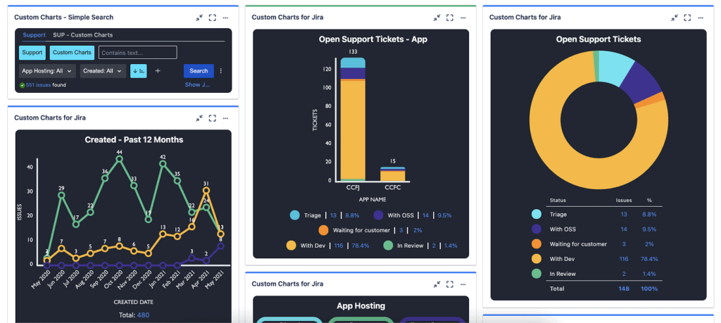
Let us look at the screenshot of a dashboard called ‘program status’ with four gadgets as an example.

The image above displays only personal issues and some issue type breakdowns for an individual contributor. You will also notice an RAG report next to it, and project status color coded with red, amber, and green which is valuable information.
Moving on, it also has solid reports like status breakdown, and average age chart. Pause, and ask: Who cares about all these things at the exact same time?
Imagine if you are glancing at your assignments for the day. Would you also- at the same time- care about all the projects in your organization? If you are coming here to figure out program status, would the issues assigned to you still be relevant then? Maybe, maybe not.
The larger picture is all about telling your target viewers a story that you’ve correctly identified, supported by the information that you’re communicating.
Are you now convinced that putting together a dashboard is more than just picking nice gadgets?
Striking a balance between powerful and clean Jira dashboard reporting
- On the left side of this page, we’ve got our project status- which is an out-of-the-box pie chart gadget from Jira. You can also spot RAG, but a proper look reveals that green is blue, amber is red, and red is Amber (mess alert!) As far as we’re trying to make our charts easy to understand not, it’s not quite there.
When you’re setting up an out-of-the-box pie chart gadget, you could set its source (the filter of the project) and the field. You can set a data refresh if you want, and that’s pretty much the beginning and the end of the configuration. What we see here is a part of your dashboard that is technically correct, but not much useful.
See the difference when you build the same dashboard in custom charts for Jira.
- Custom Charts for Jira is a vivid and super-easy to use dashboard gadget. Begin by choosing your source, and just like your pie chart, you can choose a project or a filter here as well. You can do the same thing in Custom Charts, use JQL, or do some dynamic searching. We are going to pull up the exact same filter being used on the left side.
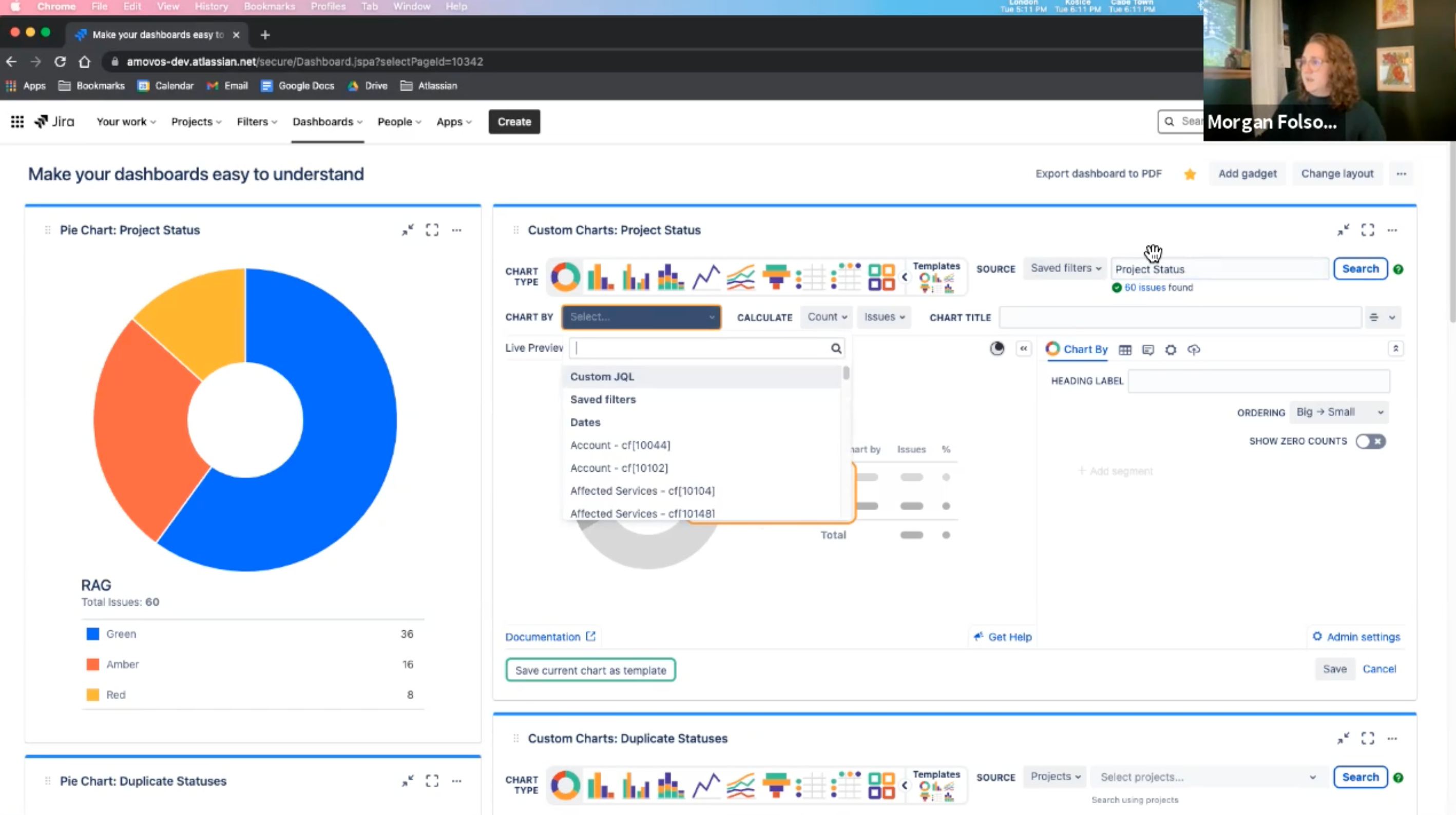
- Note that upon selecting RAG under ‘chart by’, Custom Chart allows you the option to adjust the color codes. In this case, green turned out green, we changed amber to a little more of a yellow, and change red to red. Since the colors now carry meanings, the chart instantly becomes easier to understand, and hence, more useful.

- You also get some extra information with the percentage showing. Drag and drop these if you want it to be red, amber, and green with respect to the acronym.
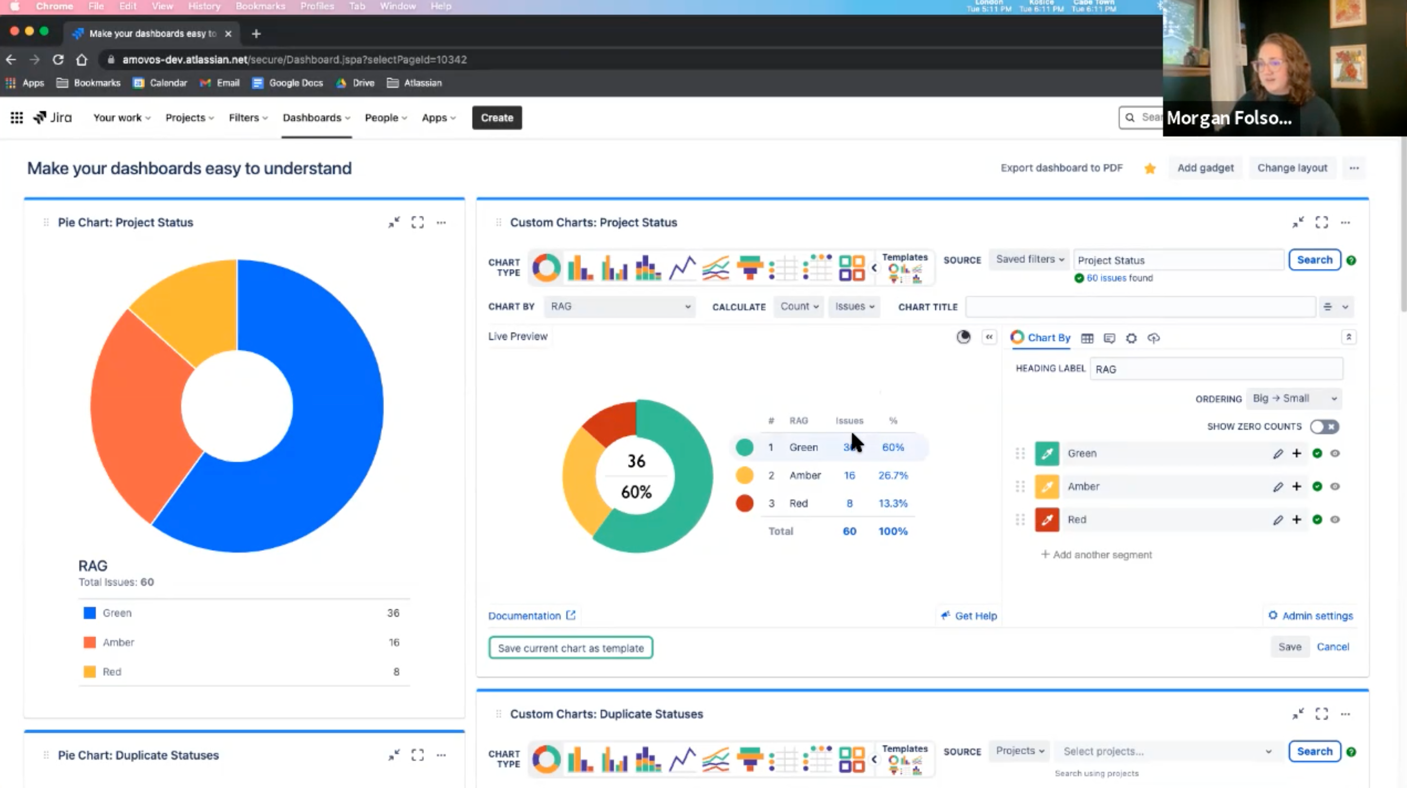
- Making your dashboard easy to understand starts with providing as much information as you can to your viewers. However, it could be tough to editorialize on a Jira dashboard. You’ve got your gadgets, but it’s not always clear what they mean. For example, what does red, amber, and green even mean? Description to the rescue!

- Now we have got a chart with the exact same source information and field, but way easier to understand. Everything is meaningfully color-coded, and if you wanted to know what these things mean, you could throw them directly on the dashboard.
Also, no more speculating if the viewer is aware of the location of the Confluence page that defines the metrics. Simply add its link in the relevant section, and you’re good to go.

Let us shift our focus to the left side again. If you have ever used Cloud, and worked with team managed or NextGen projects, you’ve probably seen a chart that looks a lot like the image below. When you have NextGen projects or team managed projects in your instance, it often creates duplicate statuses. For instance, in this case we’ve got 4 different to-dos which are mostly different colors, and not grouped together in the chart at all.

Not in a mood for all the math to figure out what is what? Let’s find out if Custom Charts makes any difference.
- In the Custom Chart gadget, we will use a filter again, pull in all the tickets, and select the chart by status. No manual grouping is required, and it already groups all those statuses together. Simply save this clear, straightforward chart now, and you’re good to go.

- Change the colors or rename ‘in progress’ to ‘WIP’- the dashboard is your playground. Users can also consider combining the ‘in progress’ and ‘to do’ into one section.

- Other than getting rid of duplicates automatically, you could also club the duplicates together. You could also group the duplicates together if your teams aren’t standardized or you have a complex workflow in Jira.
- This is a good way to have cleaner reporting without having to clean up your data. If you can try to combine duplicates and similar fields in your reporting, Custom Charts will do it for you, but there are ways to build complex filters on the backend to exclude such elements. You could also use status categories for multiple status groupings, but that doesn’t always help.
- Editorialize your dashboard as much as you can, insert documentation links, and make sure the colors carry a meaning. Statuses have a color in Jira, and aligning your reporting to it makes it distinct.
- Let us consider another example with fixed versions. The data can be messy as those fixed versions released in Jira are project-specific.

- In the above scenario, 4 projects with version 1.0, but they’re all the same release. While out-of-the-box 2D filter statistics can’t help you much with it, Custom Charts will help combine them and let you rearrange the order. Opt for a bar chart, show a straight-up table, or use tiles. Like life, variety could be the spice of your dashboard too!

- Labels in Jira are an open field and come out of the box. Every Jira instance has the labels field, and you can add- in some cases-custom labels fields which is like an open text field that lets you tag issues. Labels are especially popular with small or less technical teams because they’re super-easy to use.
However, if those teams continue to rely on labels despite being on a growth trajectory, their reporting is going to start looking like this:

The typos and formatting differences become evident as it is just an open text field. For instance, if somebody uses a dash instead of an underline in the Q2 deliverables reporting, there would be 2 labels. Imagine having to do a clean-up for correcting the errors every time before sending such reports over to your boss. Messy reporting sucks, doesn’t it?
Avoid labels if you’re pulling together reports or dashboards and worry about what people have to say about what they are seeing. Create a custom field for it or use project-specific components- a tad more decentralized, but more formal than labels. Ensuring high maintainability makes keeps your data is as clean as it could be.
- Let us now explore a template for created vs resolved Custom Charts.

We are using JQL for this source pulling in, and just to be sure that it’s only pulling in data for the current year, we have also set the range on the chart accordingly. You can also make it more specific by selecting the option to see created vs resolved data for the past 90 days using dynamic date filtering.
Trundl’s Tip
The trick is to not hard code dates for easy maintainability of your dashboards. Opt for dynamic elements such as dynamic JQL when you’re talking about people, groups, and roles over specific assignees as per your filtering preferences. Templates come handy when saving time and easy sharing are your priorities.
Top five best practices for
Jira dashboard reporting
- Make your reports easy to find It really doesn’t matter how good your dashboard is if no one ever sees it.
![]()
- Use clear and descriptive names Place yourself in the shoes of somebody who goes into the dashboard navigator, and think what their preferred search keywords would be. Try to name the categories based on an average users’ SEO skills.
- Share if you care Lest you forget, the sooner you share your dashboards-we recommend immediately-the better it is. Be conscious of whom you’re sharing it with, and don’t include people who are not involved.
- Link them to wherever your team does most of their work Does your team live out of Confluence? Try the Custom Chart for Confluence app. This enables you to build your reports directly in confluence and link to your important dashboards. The bottom line is to send it where people are working-be it Jira or Confluence.
- Simplicity is key Minimalism and simplicity are key to dashboard reporting practices. Also, be conscious of duplicate colors, try to steer clear of things that may require manual maintenance.
FAQ
How is a RAG status calculated?
This is a common use case seen in like traditional project management teams where you do more of a gut status check rather than your workflow status.
Sometimes, a project is in progress for about six months, but if you are more into waterfall and have a weekly check in, many will have a custom field. So, on each of these individual issues, you have a field called RAG, and one selects red, amber and green. Those who have advanced implementation sometimes will see this be calculated using Jira automation or the workflow.
If you have budget versus timeline, status, or budget health, timeline health, etc., you can do some fun stuff with those calculations.
Can Custom Charts create Agile specific carts like velocity, burn down and burn up charts?
Yes, Custom Charts can do some of the basic Agile reporting.
Can we embed links into the legend on the chart?
We can use the description on each of these charts. The Jira comment editor gives you the option to add like colors, insert links to a Confluence page, and more. Anybody viewing the dashboard just needs to click on it for more details.
Are the permissions of these dashboards the same as that in native Jira?
Yes. You can add the Custom Charts gadgets to a dashboard just like any other gadget and modify them if you are one of the owners on the dashboard. All other users in your instance can view the dashboard if they have the permissions to do so.
Can we automate the reports from this dashboard?
As far as automating what data is pulled in, yes. As far automation in terms of creating dashboards, no. Since Custom Chart is up to date information from Jira, the page is refreshed every time you refresh the dashboard. You can also use some of the same auto refresh options on your charts if you want them to refresh in the background. The template and import-export options help reduce manual efforts if you are creating multiple similar dashboards.
Can you add columns and number fields like totals and spreadsheets?
Yes. Charts can pull in just issue counts, and you could also pull in any number fields, or do the sum or the average.
If you want to have more at once, go to the legends tab to add multiple calculations options. Count issues, and projects included or add story points. You could also calculate original versus remaining estimates- next to each other- plus time spent and include it in a table view. Issue filters will also be a part of the charts soon.
When do you create personal dashboards instead of using a Scrum or Kanban board?
If you specifically want to know what is being worked on right now or looking for information on how long it’s been in a status and the status of your workflow, board it is. However, if you are looking for higher level insights, the dashboard is your best friend. We recommend you have both available to get the best of both worlds.
[DEMO] Jira Dashboard Reporting Best Practices
NOW IT’S YOUR TURN
Tell us what you think of this article. Would you like to suggest a correction? Do you need further help with the next steps? We’re all ears! Please write to us!
Disclaimer: The views and opinions expressed in this article are exclusively those of the author and do not necessarily reflect Trundl’s official policy. Please note, the information provided may be subject to change.
Get a quick demo on Jira Dashboard and Reporting
Drop us a line, we will get back to you on Licenses, Deployment and Support